Client un.studios
Year 2023
Services Brand Design, Digital, Print, Motion
Visualizing sound was the beautiful challenge in shaping the brand and web presence for our friends at un.studios—a music production and sound design studio. With detail over flash, we built a brand ready for the international stage.

Starting point
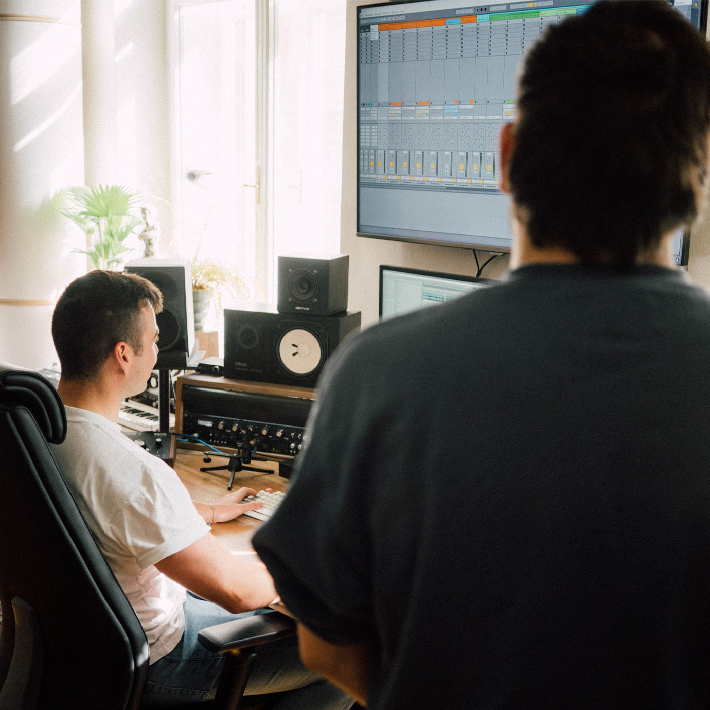
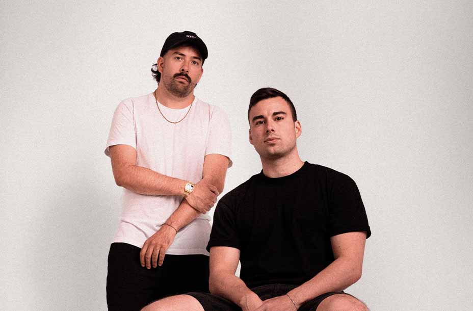
Clemens Markart and Simon Dolliana founded un.studios in 2020, fresh out of university. From a small base in Graz, the studio quickly expanded to international clients—from Dolce & Gabbana to the trailer for the award-winning film “King Richard”. To match their powerful sound, we developed a brand design that marked the next step in their journey – one that reflects their bold yet sensitive approach to every project.
The idea
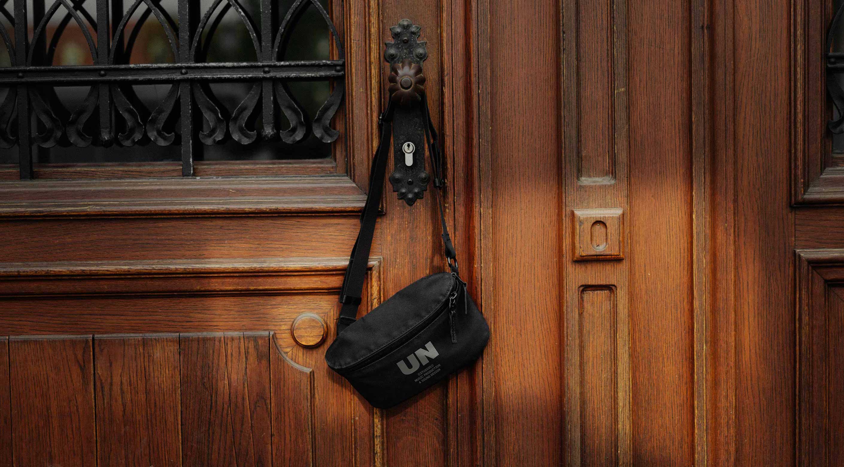
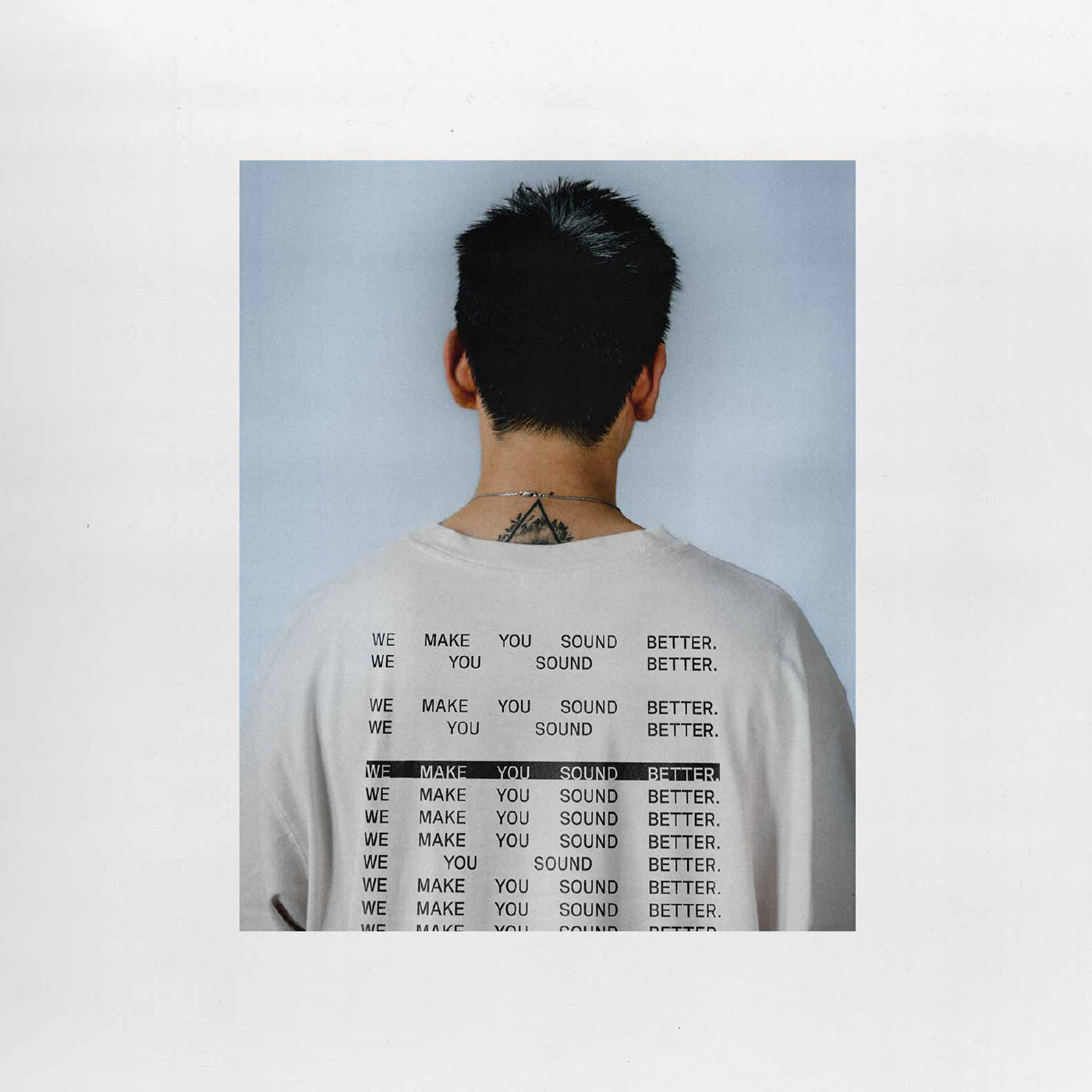
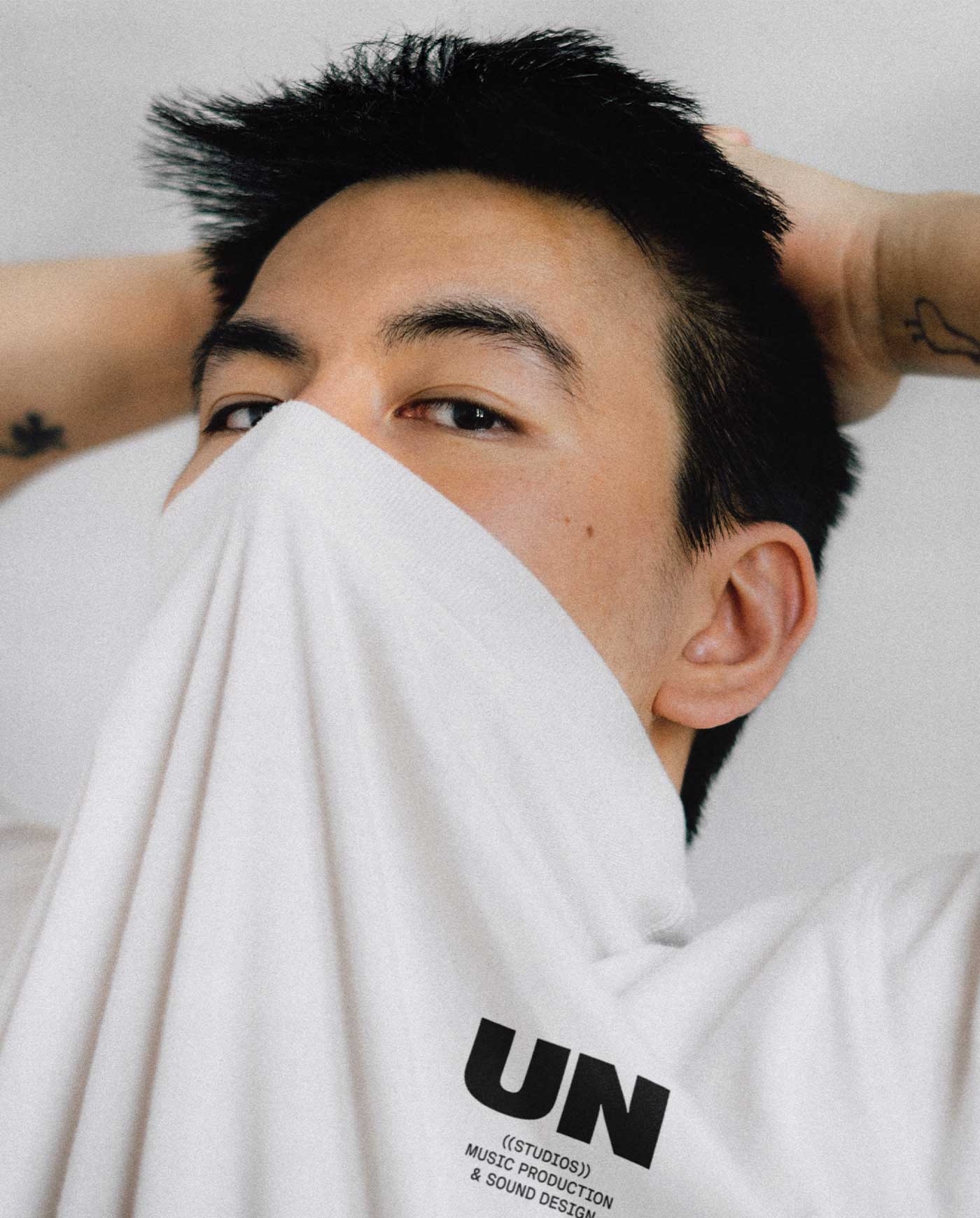
Sound and film are inseparable, one is never as powerful without the other. Our brand design takes inspiration from film credits, often placed at the bottom of a movie poster. A semi-monospace font evokes the nostalgia of velvet cinema chairs, while the bold “un” letters seem to vibrate in the humming soundwaves of a movie trailer. Details carry the concept further: brackets around “studios” expand like sound waves in the digital touchpoints. Motion design ties everything together, letting the brand speak for itself. The rest stays minimal, with simplicity and quality over flash. The loudest part of the new un.studios brand design is its confidence.
The impact
This project was about supporting friends first, more than pursuing impact. Still, we carefully executed the entire project to our values: hosting on renewable energy and printing business cards locally with (biodegradable) soy ink. We gave un.studios a design they feel confident in—a professional update ready for new challenges and international clients.
Credits
Brand Design, Digital, Print, Motion
RAWTY
“RAWTY helped us to get to the core of what we truly want to represent with our brand. Their work helped us feel extremely confident in our industry.”