RAWTY. Branding our own sustainable design studio.
2023
Designing our vision, creating our future.
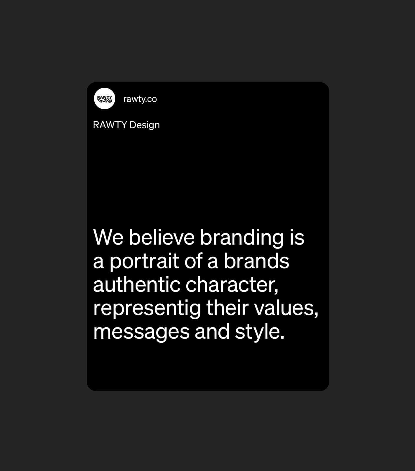
RAWTY stands for the raw, untamed nature of our planet. It feels like wild waves crashing against rough rocks or the sensation of touching the bark of a tree. The goal was to visualize that feeling, explain our vision for the studio and our ambition to drive socio-economical change. It wasn’t the easiest task, but it sure was a lot of fun.
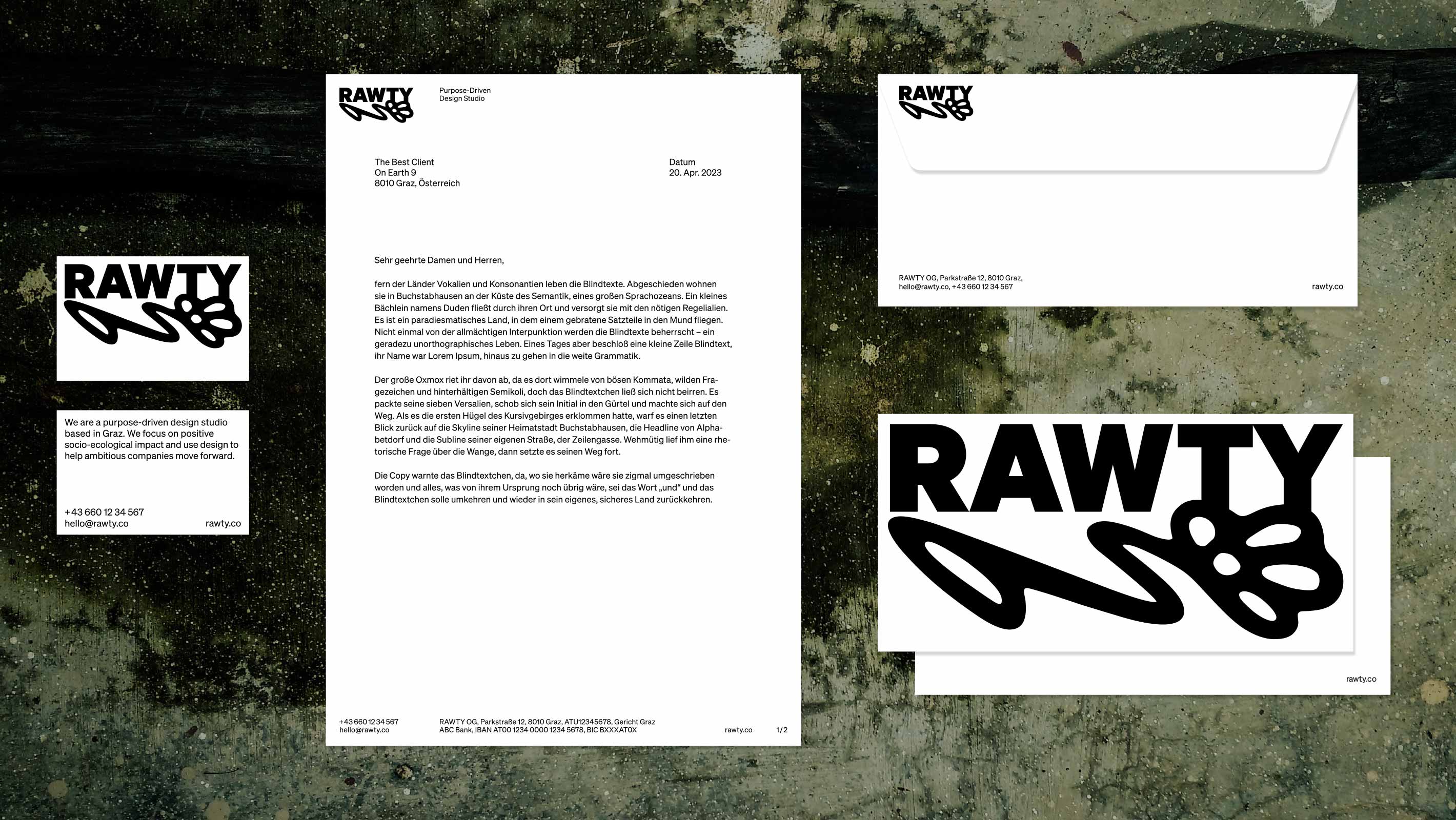
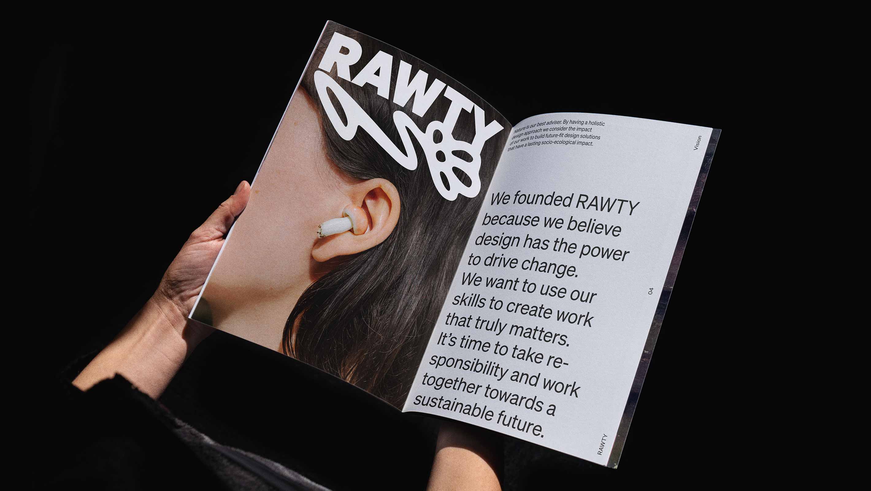
We wanted to create a design studio that had the compelling personality of a brand. Our branding is scalable on a continuum from clean and calm – with a lot of space for client projects – to fun, playful owned content.
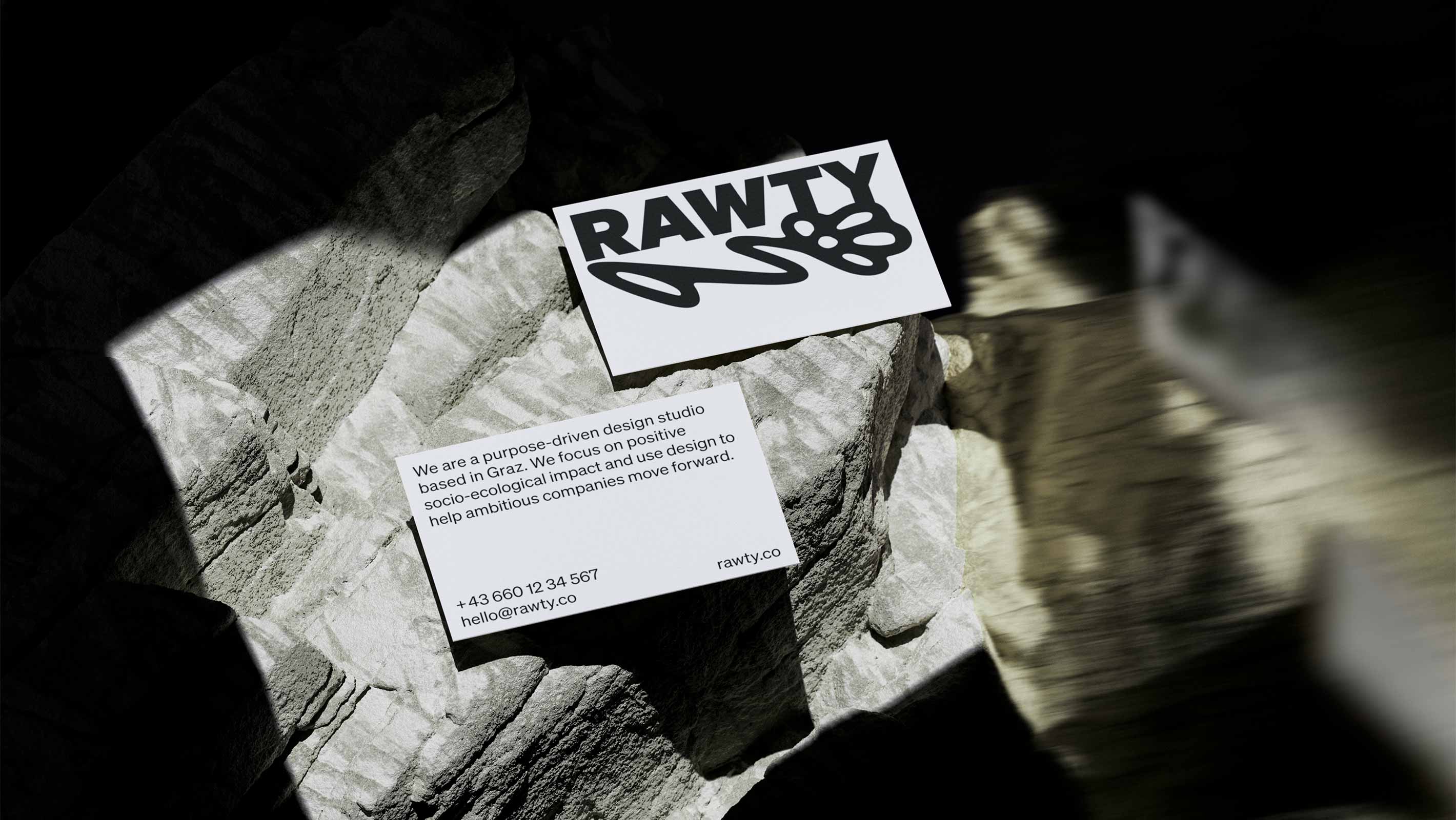
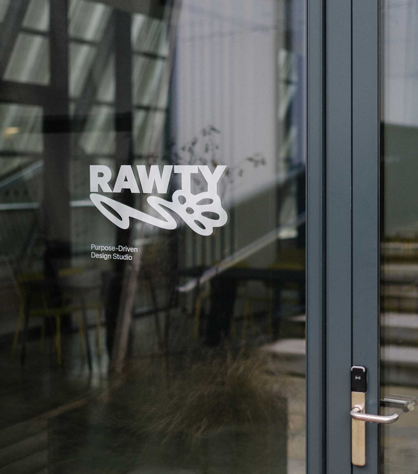
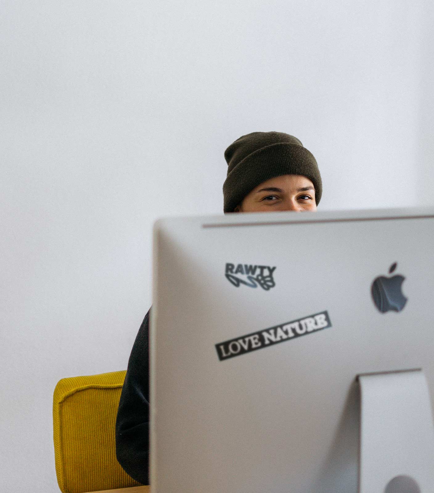
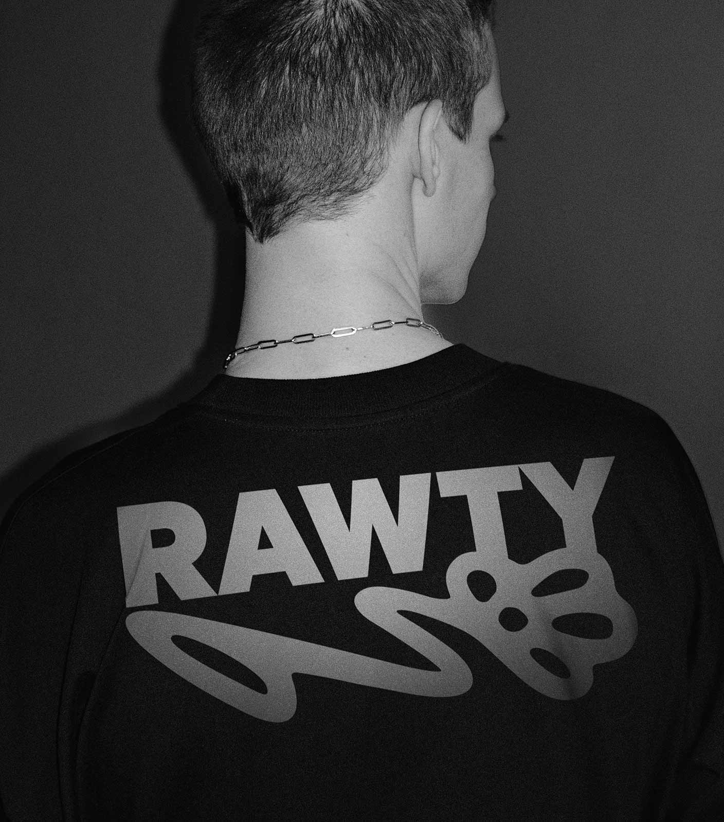
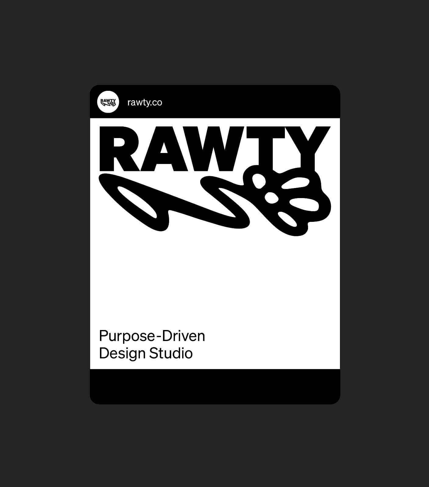
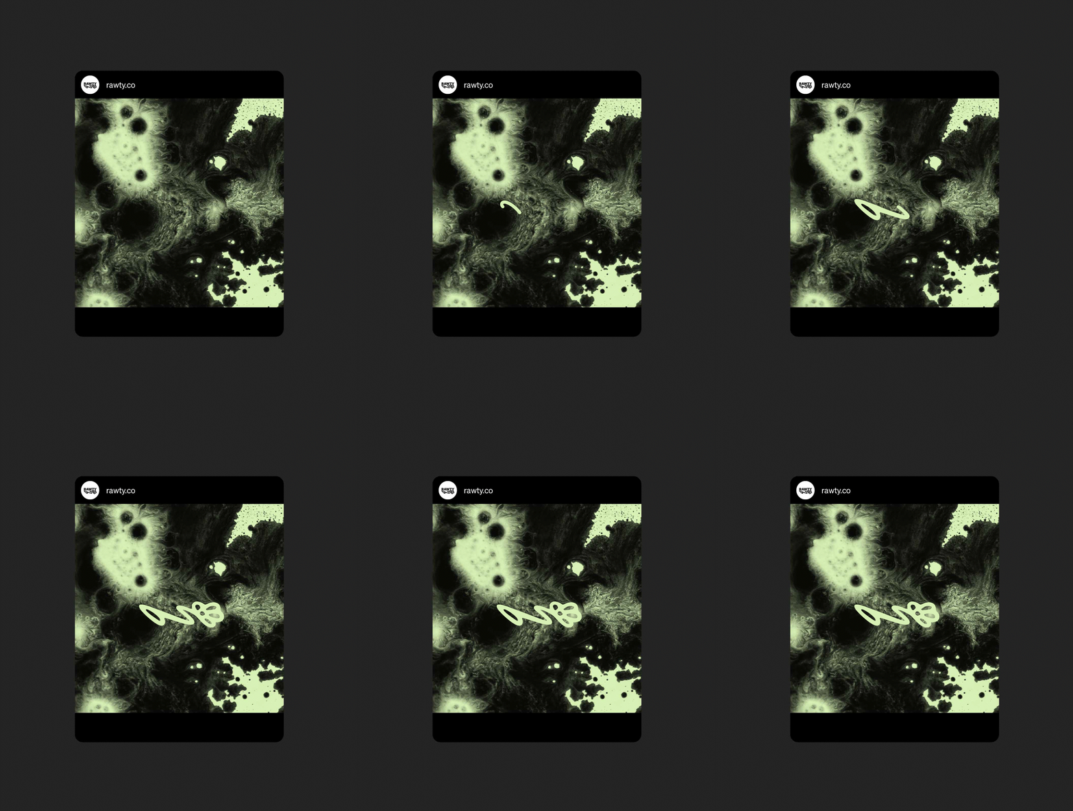
We wanted to design a logo that stands out. A logo that has a natural, analog quality while being strong and clear in all sizes. The Floosh – as we call the flower underneath the typeface – represents our love for nature. We borrowed from the graffiti aesthetic for a flowing and rebellious feel.
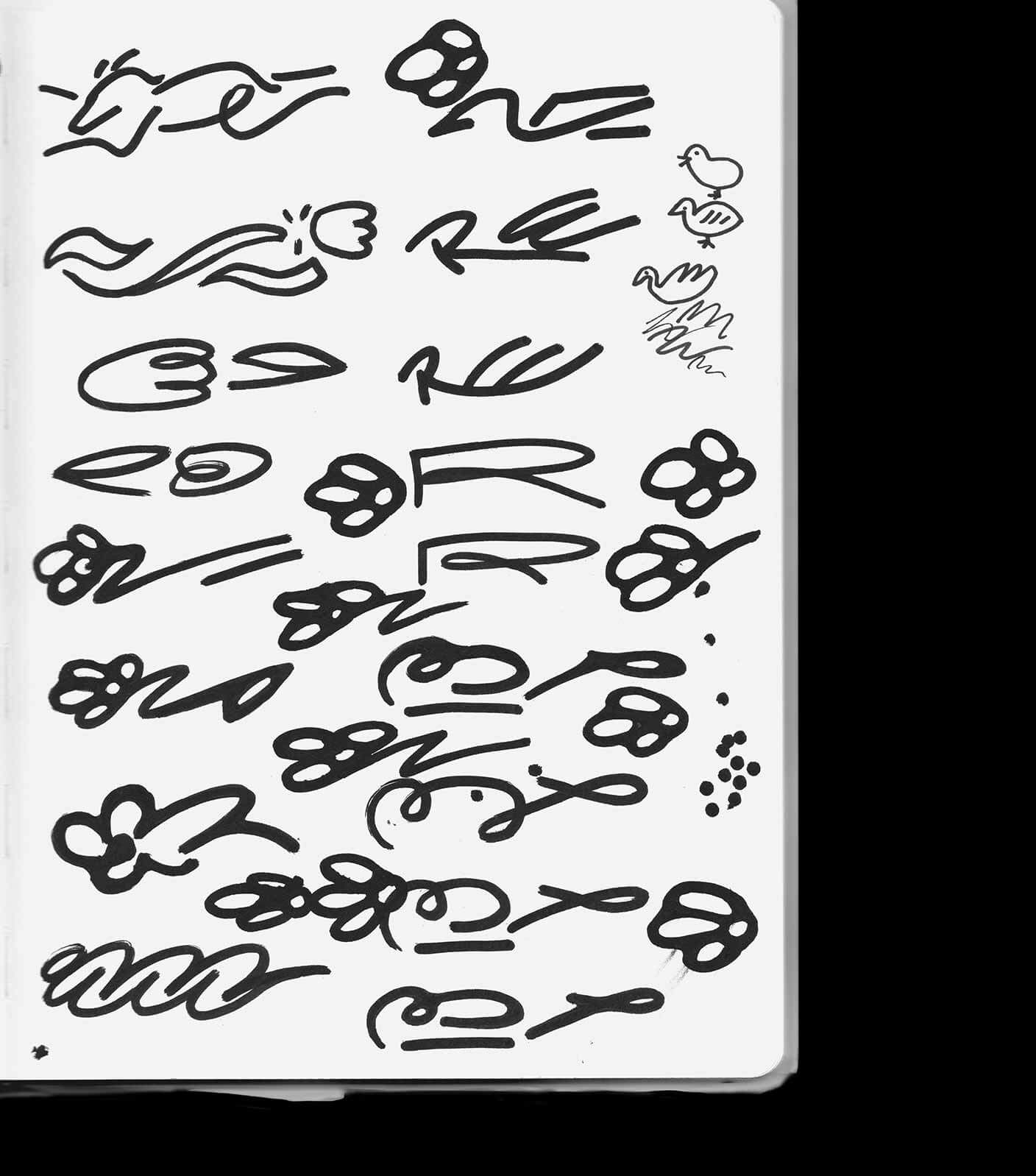
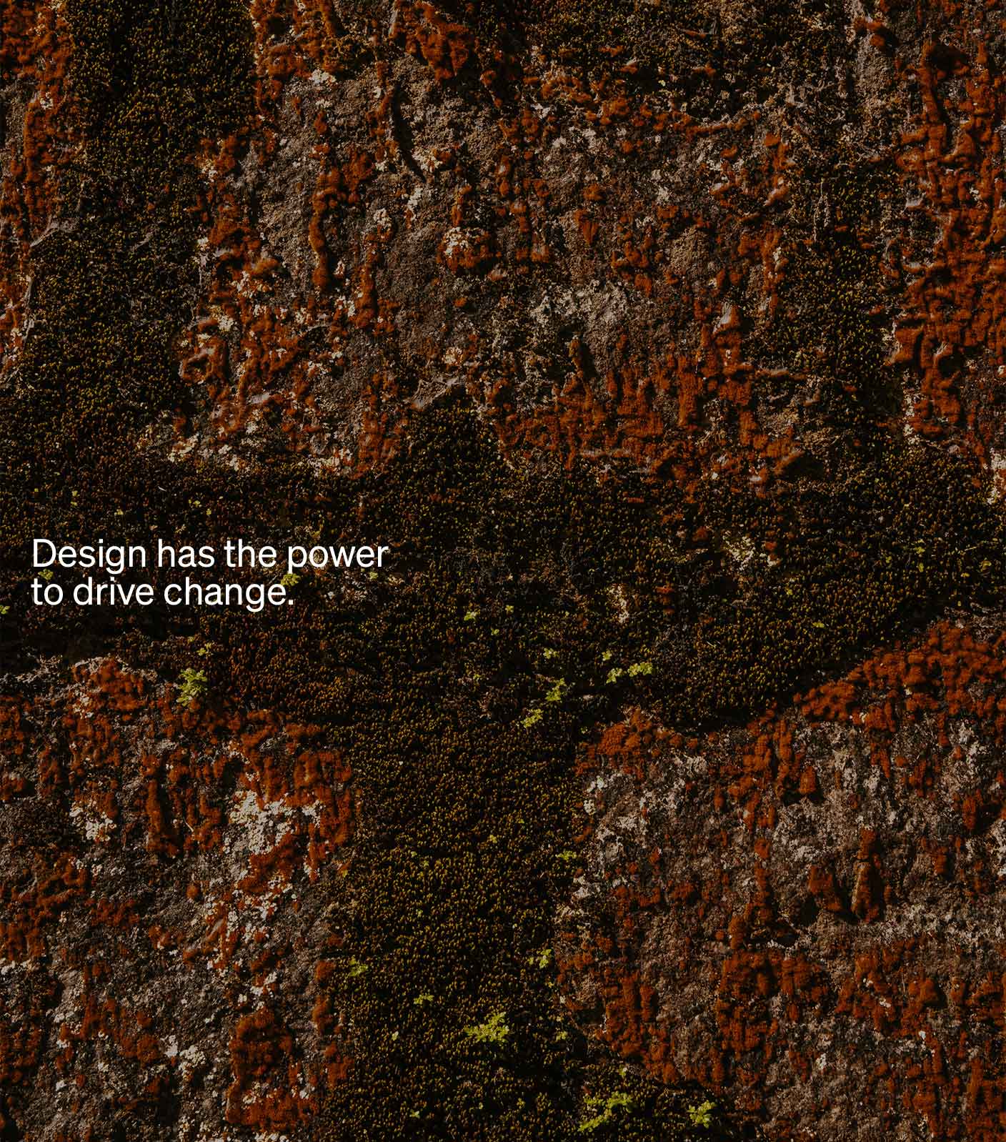
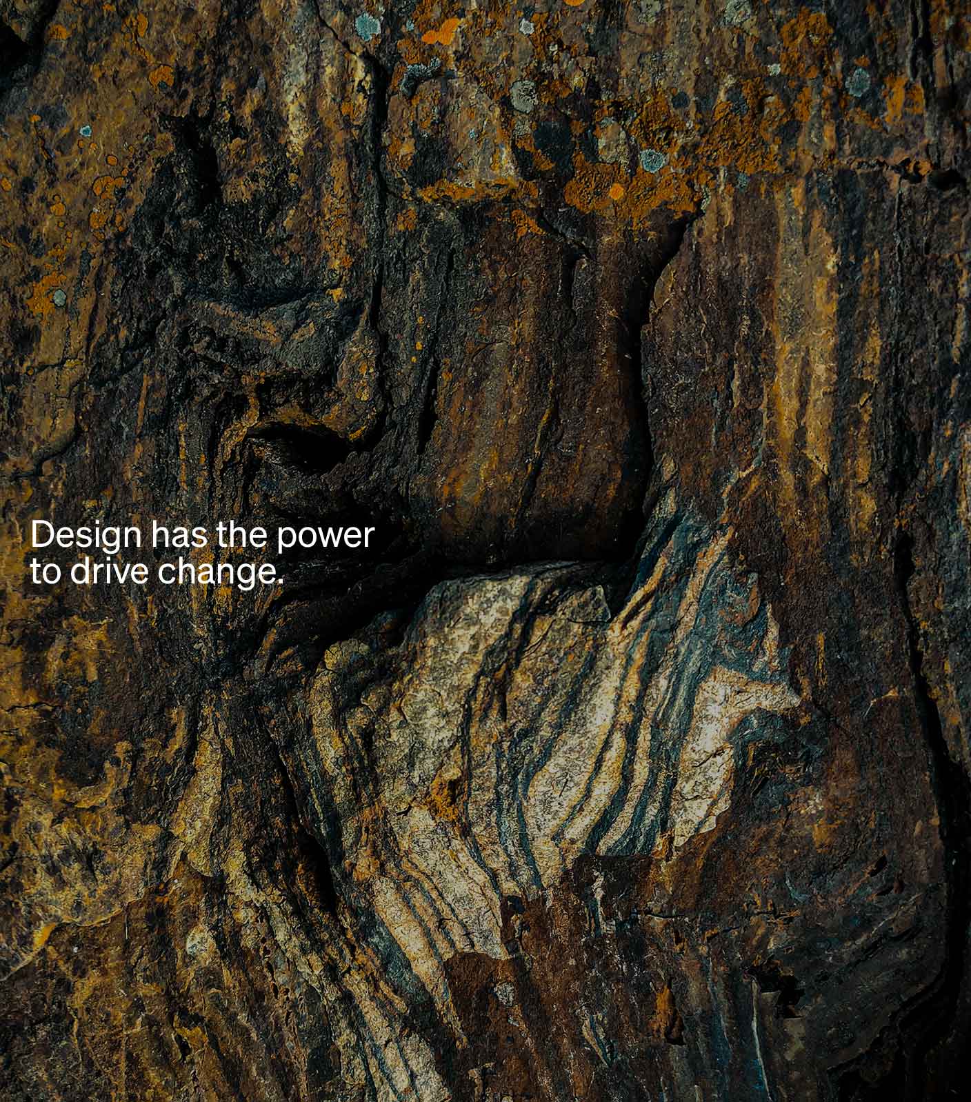
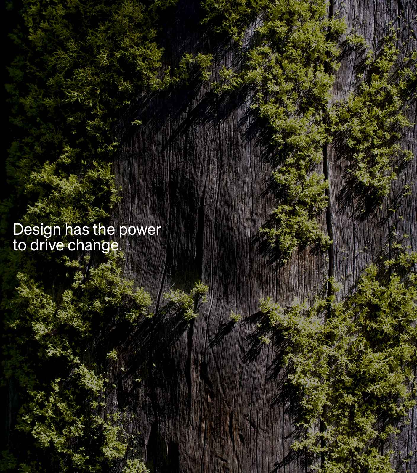
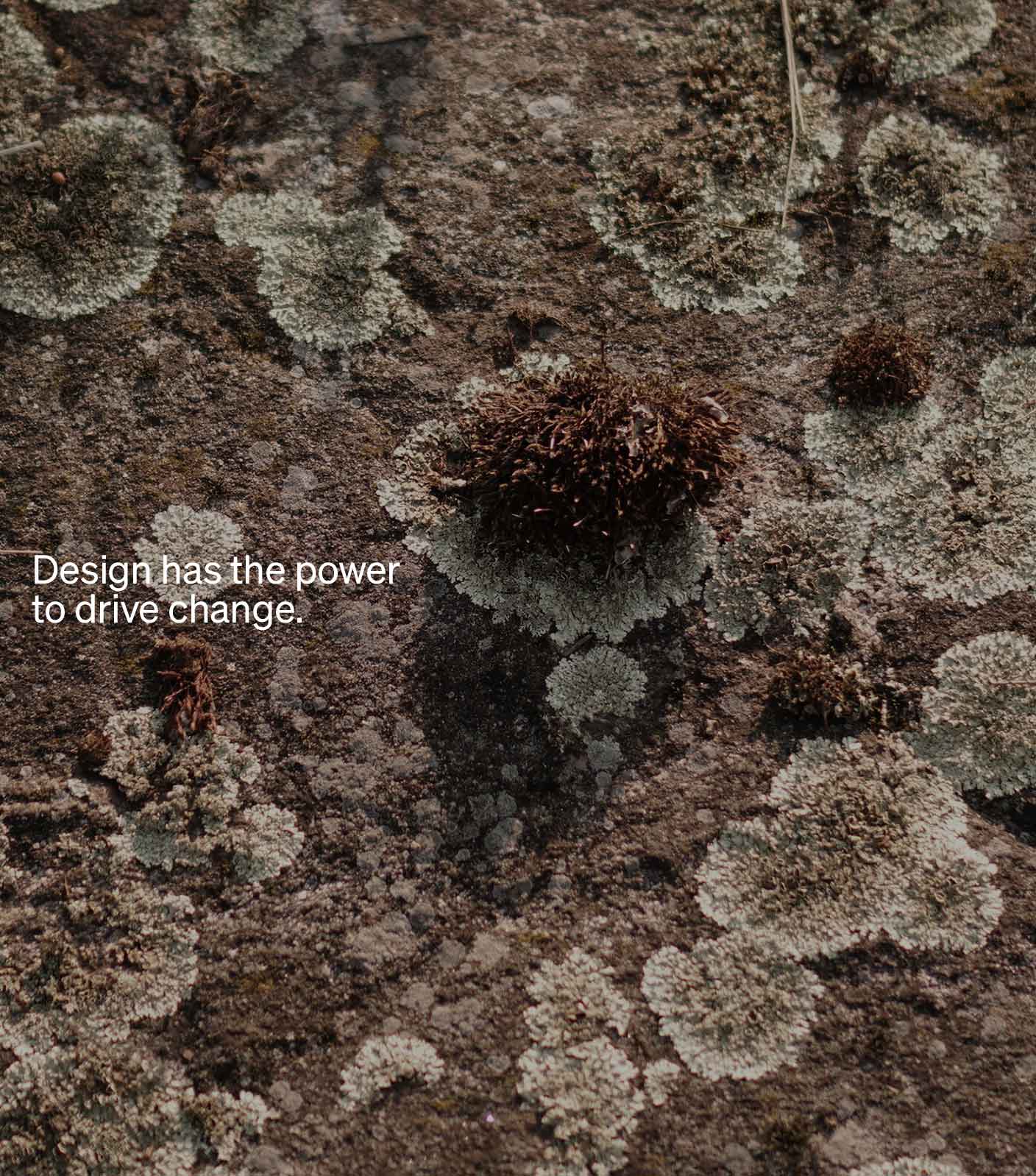
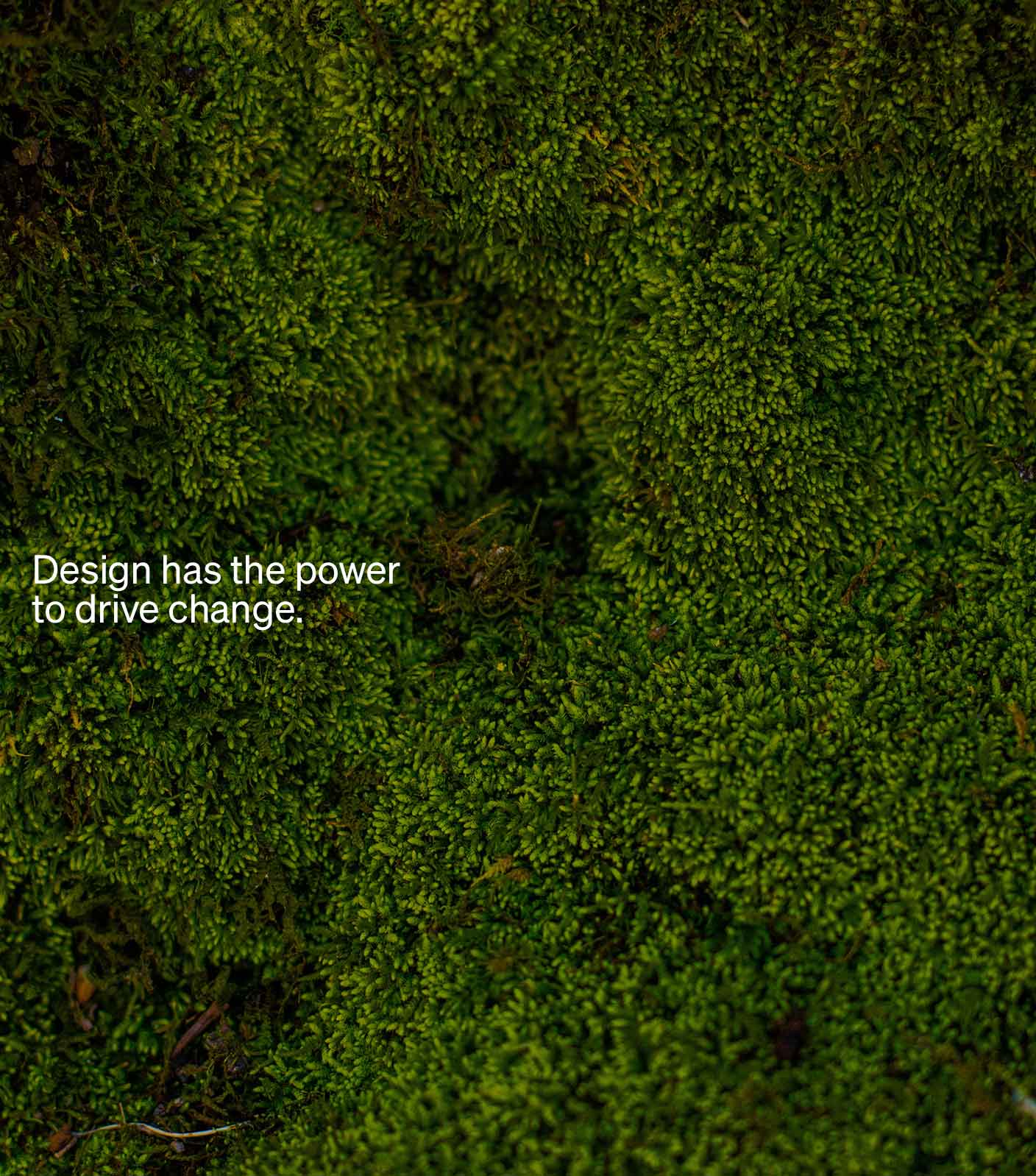
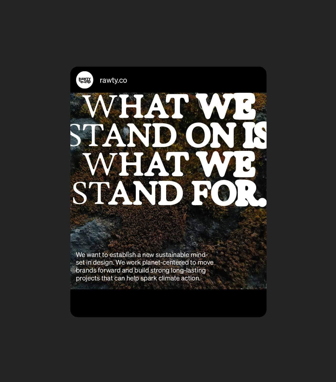
The RAWTY Design is based on the idea of nature and humans coming together. We used a variable font that mimics the process of growth and decay additionally enhanced by our motion design. As a contrast we chose a modern, clean font in black and white to transport our message without distractions. To highlight certain elements we added a light green. The imagery consist of macro photography of different natural surfaces like moss, bark or stone and pictures that have an urban, street-style feel to them.

Services
Brand Strategy
Brand Positioning
Brand Identity
Lettering
Web Design
Motion Design
Photography
Credits
Christian Leban.
Tessa S. Huber.
Sophia Stöhr.
Big thanks to:
Johannes Fischer. 3D Animation
Martina Huber-Krieger. Proofreading/editing
Gabriela Penic. Proofreading/editing
More work
Lets take action together.
Get in touch hello@rawty.co
• Hosted on green energy and built following low-carbon principles.


