Client Purkarthofer Eis
Year 2024
Services Brand Strategy, Brand Design, Digital, Print
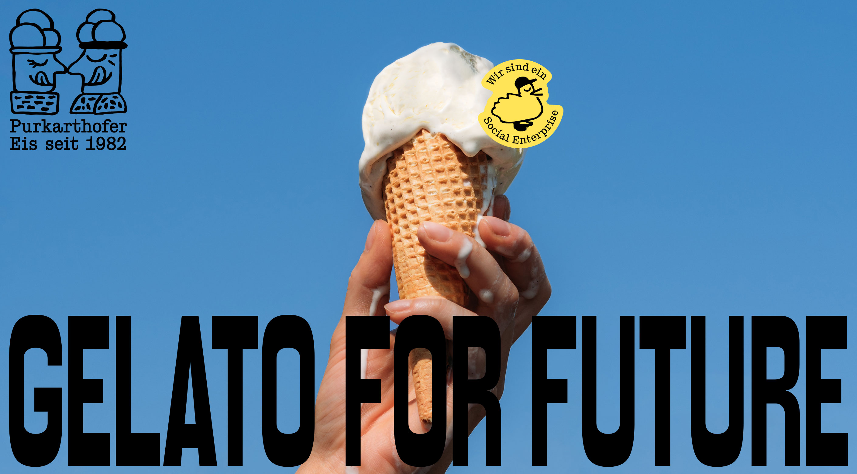
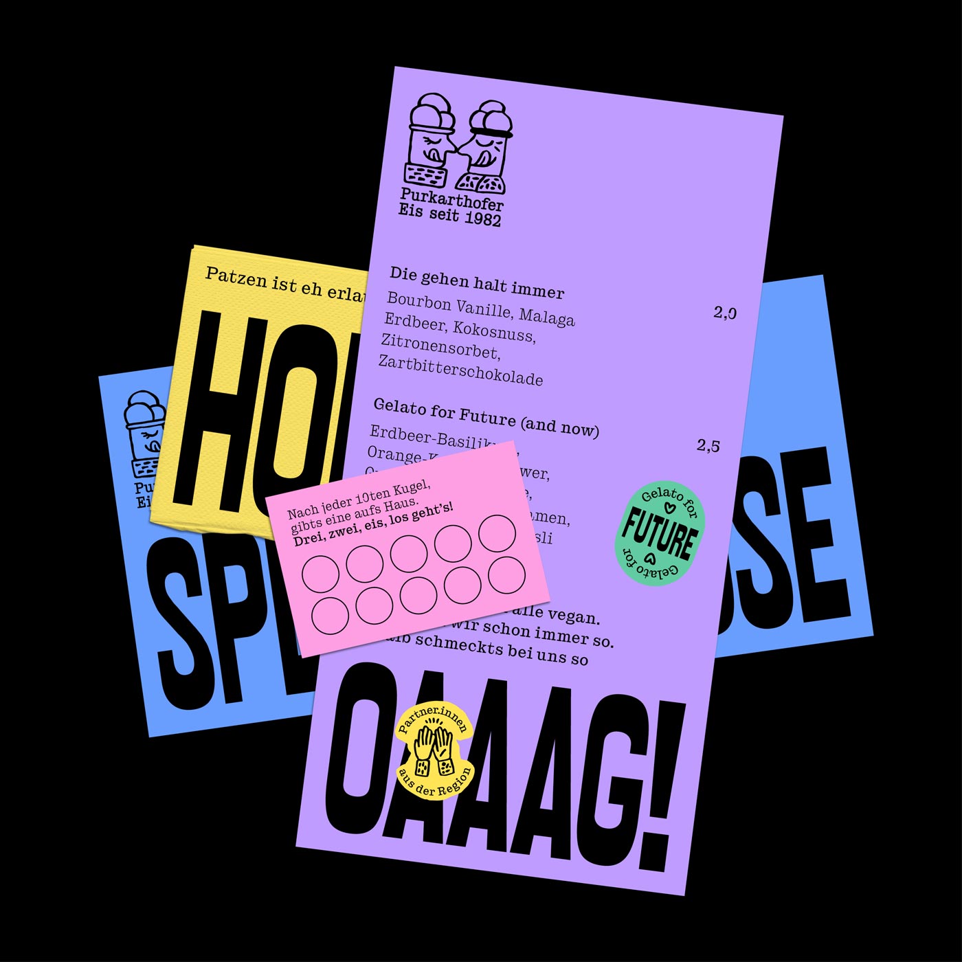
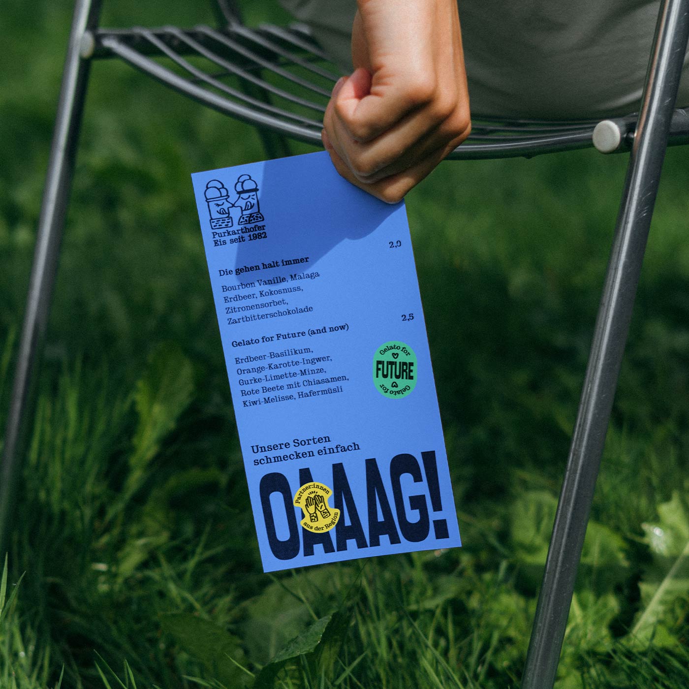
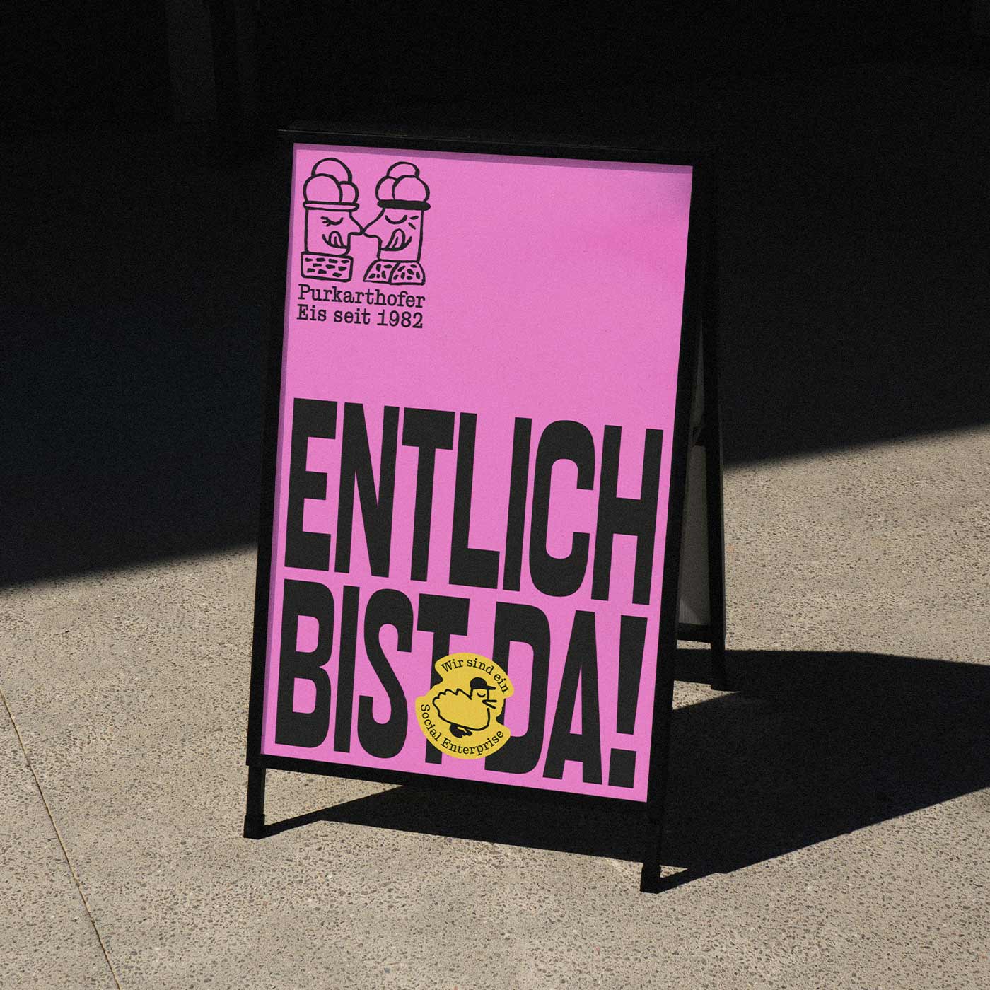
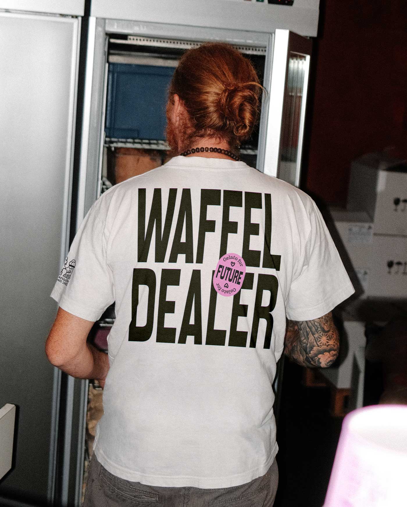
Purkarthofer’s “Gelato for Future” mixes the finest ingredients—regionally sourced through regenerative agriculture or crowd-farming—with zero-waste production and New Work practices. The colorful identity brings these innovations together and captures the simple joy of eating ice cream.











Starting point
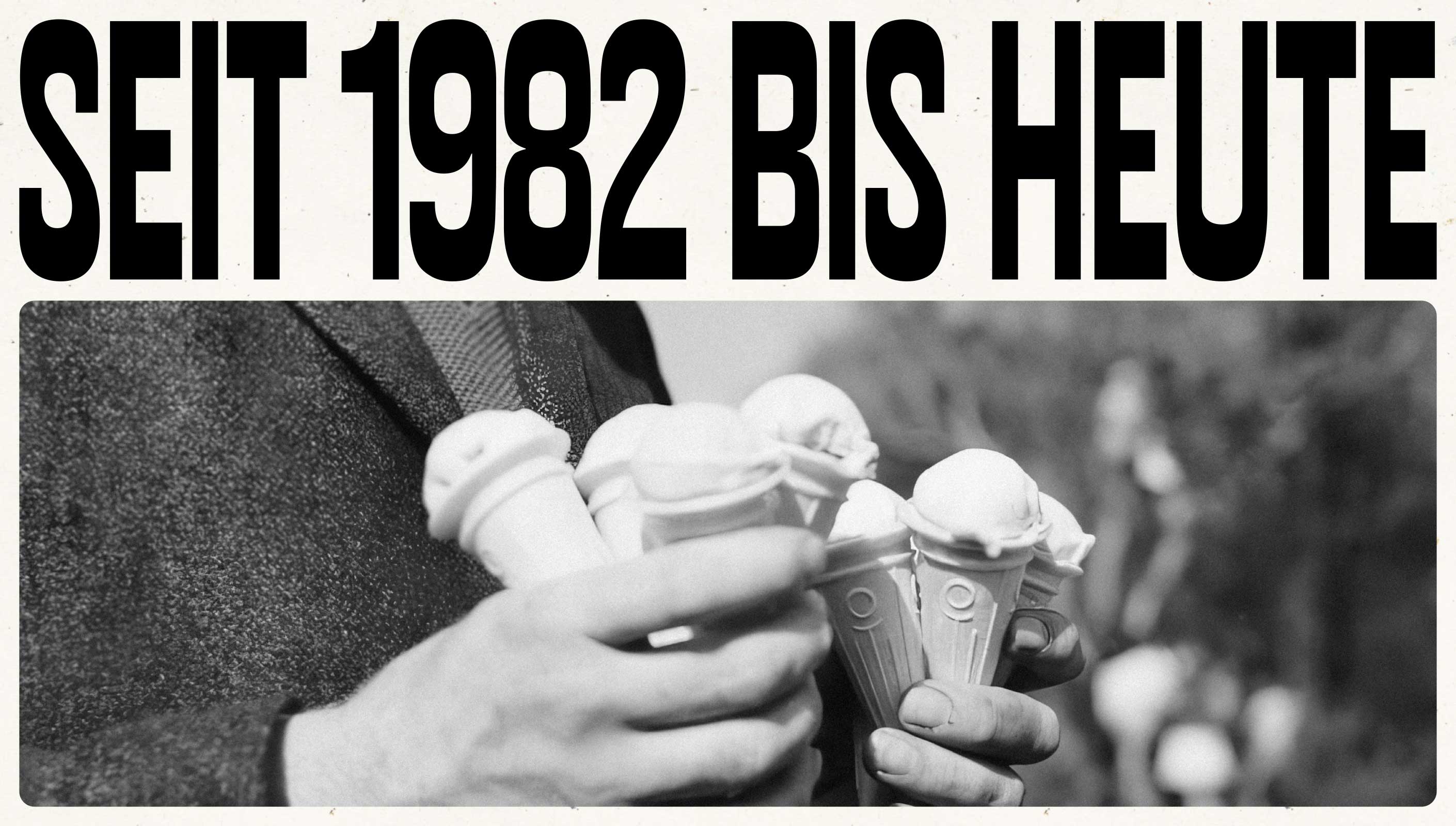
Since 1982 the Purkarthofer family has made pastries and ice cream with care. After inheriting the family business Klaus Purkarthofer’s vision is to build a future-ready company that sources responsibly and fully focuses on impact. The rebrand pays respect to tradition while speaking to a younger, eco-conscious audience—without losing the trust of long-standing customers.
The idea
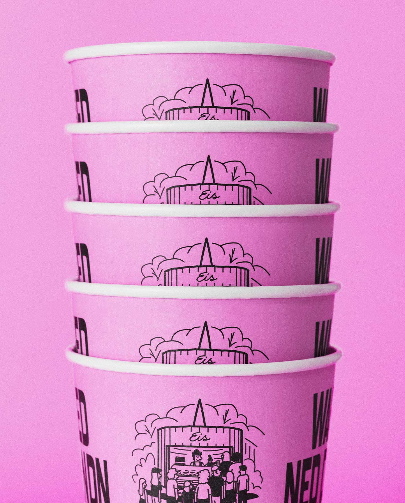
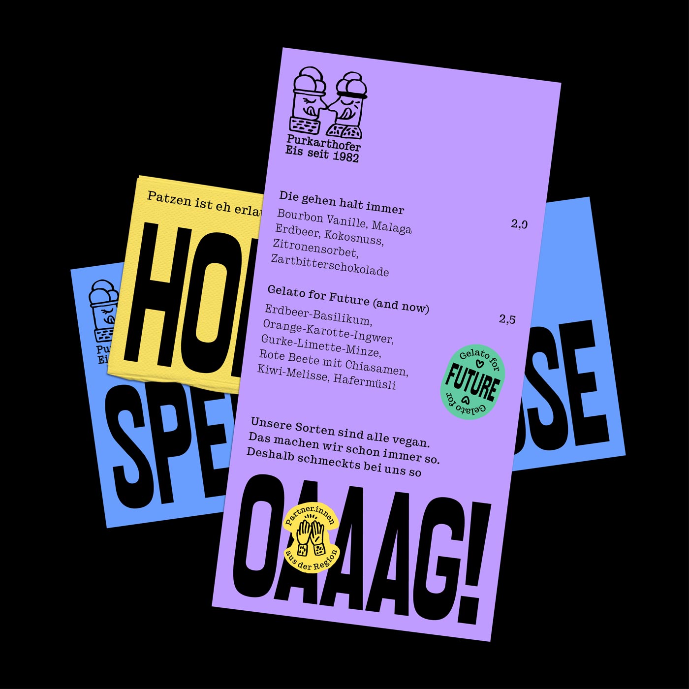
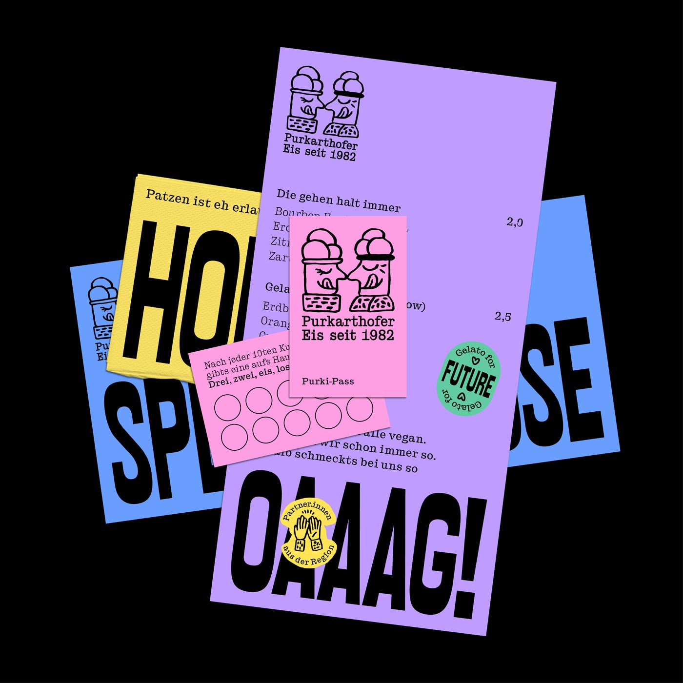
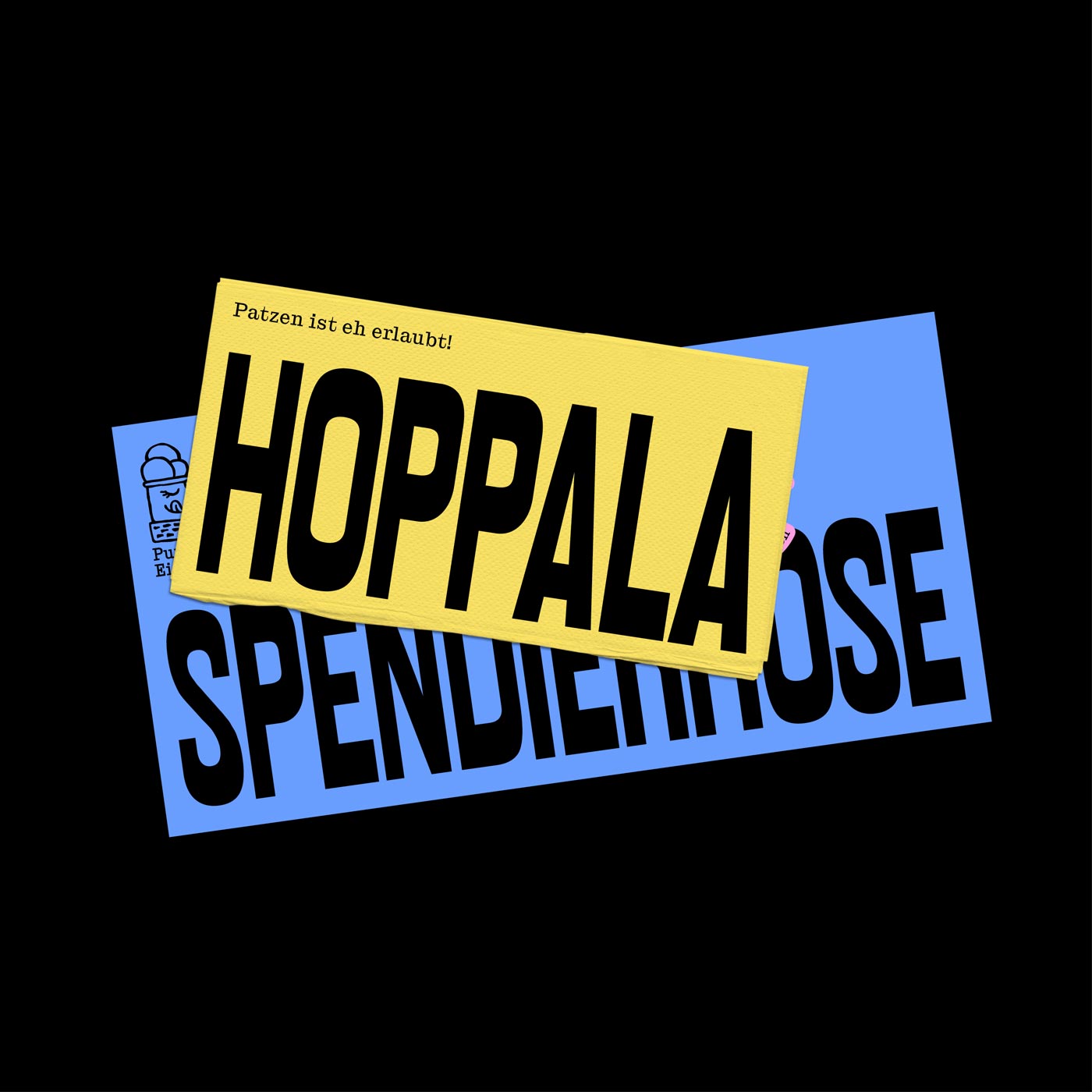
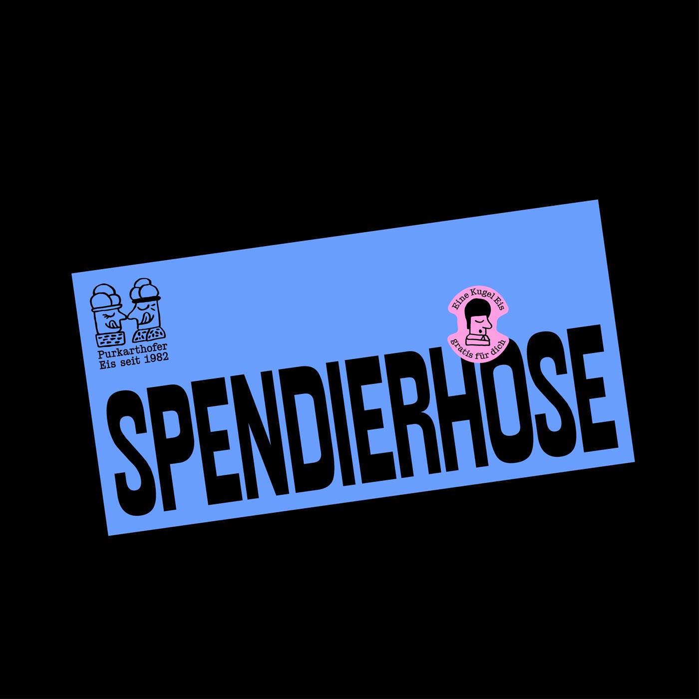
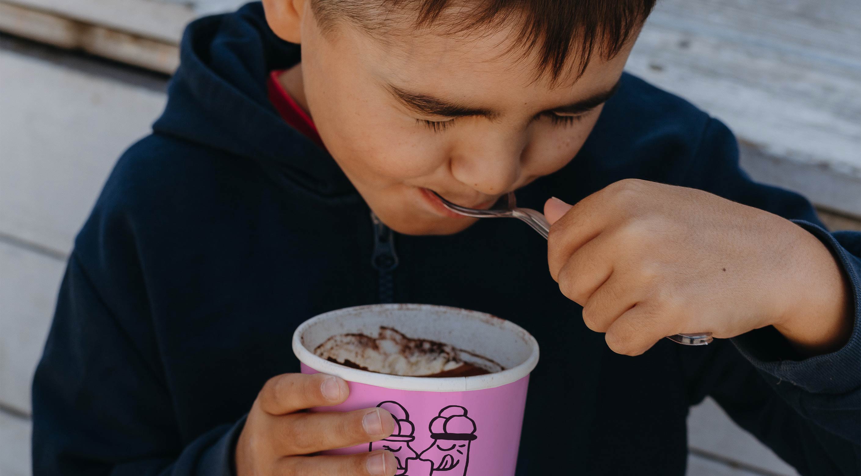
The identity blends heritage with a bold future vision. Short, witty text in Styrian Schmäh (local slang words) gives the brand a local, human voice that resonates with both old and young fans. Playful illustrations become a flexible system of patches that highlight their many initiatives. The logo, featuring two heads facing each other, captures people coming together over ice cream. A classic body font honors history, while the bold headline font signals the new era. Paired with a palette, inspired by the ice-cream counter—from creamy vanilla yellow to fresh basil green. Working closely with the Purkarthofer team, we developed a brand identity that balances tradition and innovation, capturing their joyful, purpose-driven spirit.
The impact
Klaus Purkarthofer’s vision is to create a better future by sourcing ingredients responsibly and building an impact-oriented company structure. With New Work measures, every employee can contribute ideas and help shape the business, making purpose and innovation visible in all aspects of the company. The new identity made this visible: suppliers, partners and customers now see and feel Purkarthofer’s values. The result reflects their mission, has been embraced by stakeholders and strengthens their growing standing as a role model for other companies. After the business transformation they finally have an identity they feel proud of—joyful and purpose-driven without leaving its roots behind.
Credits
Brand Strategy, Brand Design, Digital, Print
RAWTY
Web Development
Christian Hörzer
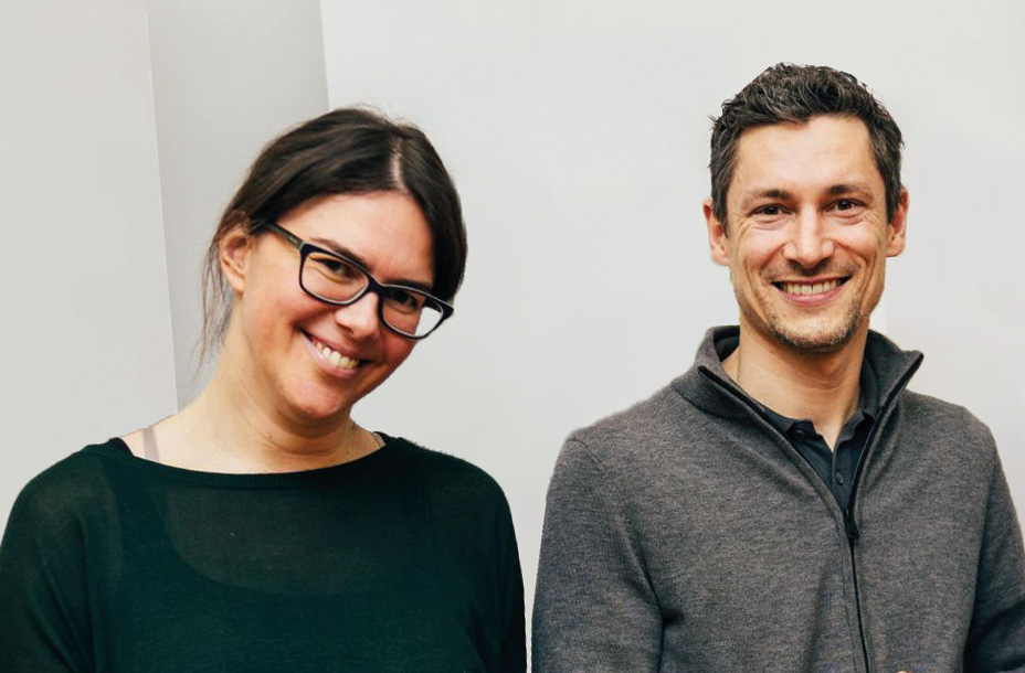
“With purpose-driven design agency RAWTY, we found exactly what we were looking for: dedicated people who support us as a social business […]. The implementation of our new brand design was a complete success—many responses from our stakeholders have already confirmed this. Our aspiration to be a role model for other companies has been given an ideal face. Working with Christian, Tessa, and Sophia feels wonderfully easy, professional, and connecting for us. […]”